The start of November saw NHL franchise Arizona Coyotes introduce a community-focused, culture-driven rebrand called ‘We Hockey’ to amplify the resurgence in Arizona hockey.
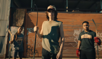
Launched as the NHL season kicks into gear, the Coyotes campaign reflects its unusual positioning as a professional ice hockey team born and built in the least likely place for the winter sport to flourish – the desert. And the new identity celebrates its origins and invites the state to reimagine what hockey fans and a hockey team can look like.
Created in partnership with agency MullenLowe Los Angeles, the new design, communication and identity seeks to celebrate diversity in a fresh approach that the team believes the NHL hasn’t quite seen before. A blend of authentic, real-life stories and diversity seeks to showcase what can make the game a more representative, dynamic and aspirational sport for communities that may have not previously imagined having hockey in their neighbourhood.
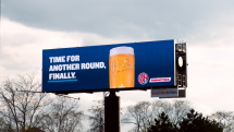
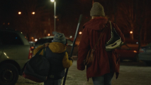
The integrated initiative spans several films – spearheaded by a visually striking ‘Anthem’ spot posted on 10 November – as well as outdoor work, paid digital partnerships (with Spotify and Pinterest), plus an interactive AR filter on Instagram and in-game activations.
The rebrand also brings the team’s Kachina logo back to the forefront with an authentic colour palette that is informed directly from the natural landscapes of the state, while the lead anthem spot features Olympic Silver medalist and IIHF Gold medalist Lyndsey Fry alongside authentic Arizona hockey fans and players of all levels and demographics to shine a spotlight on the wider Arizona hockey community’s strength in diversity and acceptance.
As the campaign states: “We believe in a culture where every fan has a seat in our house. And we believe in celebrating this city’s people as much as we celebrate our players. Because we are not just a team. We are a pack. This is hockey. The Coyotes way.”
The hero spot acts as a love letter to all the Arizonans who love hockey and all those who don’t know they love it yet.
“From the outset, our mission for this rebrand was to capture and reflect the unapologetic energy emanating from the Valley each day. This organization is a living, breathing example of what it means to be genuinely modern with an authentically inclusive culture,” explained Arizona Coyotes SVP Of Marketing Tania Moreno. “By using the tools of our brand’s platform to elevate hyperlocal stories, we seek to invite the next generation of hockey fans across a universal spectrum, one truly representative of our region, into our Pack.”
This idea was brought to life through a lead film which acted as a tribute to the people and the place. It was shot on locations across the state and stars genuine Arizona residents from across the age, gender and ethnic spectrum – a team of fresh, unexpected faces reflecting the outward representation of the team and the brand.
“Hockey’s future growth will be fueled by the deeply authentic relationships we are creating today within our increasingly diverse local communities,” added NHL Senior Executive Vice President of Social Impact, Growth, and Legislative Affairs Kim Davis. “This anthem represents a shift occurring within the Coyotes’ organization – and the NHL more broadly – that challenges traditional models of doing business, and illustrates intentionality behind their outreach to new demographics by representing the multitude of faces, voices and perspectives within the brand.”
The films were helmed by Director Tino of Love Boat Productions and photographed by Carmelo Varelo of Holyrad Studios in Arizona.
“The work celebrates the next era for the sport of hockey in an unexpected and disarming way, with elements which are executed with the highest level of film and design craft. The creative strategy was birthed behind the ethos that the Coyotes play with, a winning culture versus winning hockey. We are excited to help bring to life this challenger brand that invites culture on and off the ice,” added MullenLoew Head Of Design Fabio Brigido.
Comment
The objective sitting behind the rebrand is to bring to fruition the Coyotes’ mission to build the best team for their community, their fans and most importantly for future generations. The project sought to build a bridge between community and the rink and opens doors to all who love the sport, and to the many more who may not even realize they love it, just yet.
The campaign is fundamentally built around the word “we” to drove home the message of inclusion and reinforcing the notion that this is hockey like we’ve never seen it 0- hockey for all.
The latest work follows on from last summer’s ‘Howl Yeah’ refresh and 2016’s ‘Coyotes 2.0’.












Leave a comment
You must be logged in to post a comment.