
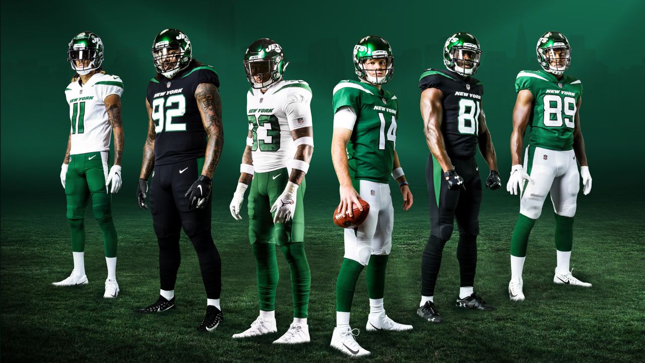
From the logo and the typeface, to the helmets, uniforms and apparel, early April saw the New York Jets launch a team-wide ‘Legacy’ rebrand which blends nostalgia with the future by reworking the late 1970’s Jim Pons design for the digital age in a nod to the team’s so called ‘Sack Exchange’ era (1979-89) that simultaneously modernises the team assets in a ‘cool/nostalgia’ combination that resonates with both older and younger generations of NFL fans.
Objective
The design brief, which came five months ahead of the new season, was to honour the club’s history, respect the fans’ wishes, but simultaneously ensure that the team’s rebrand also looks to the future with reference to a prouder past that points the way to a prouder future.
Activation
Designed to combine ‘contemporary coolness and nostalgic tradition’, the best-of-both-worlds rebrand reintroduces a jet to the logo for the first time since 1997 as the overall design is a neater, stronger and bolder, modernised update of the team’s primary logo originally designed by Jim Pons (the team’s former video director and bass guitarist for Frank Zappa’s band ‘The Mothers of Invention’.
Updating a classic for today’s tech-led, digital landscape, a streamlined font adjusted and condensing the spacing between the letters to be more consistent, while the tail of the J is taller and thicker and the jet itself is bolder, thicker and more pointed to elevate the look.
The original jet logo was used from 1978 to 1997 and is connected to the team’s fondly-remembered ‘New York Sack Exchange’ era and the kit design includes the double striped shoulders and single stripe pants – the same design the team wore throughout that Sack Exchange period.
A full suite of secondary logos was developed to reinforce and expand the Jets brand identity: these logos incorporate key characteristics of the primary mark, including font, color and in some instances, the distinctive shape of the Jet.
Alongside the ‘Legacy Logo’, the team also unveiled its ‘Legacy Collection’ led by helmets and three new uniform versions (legacy green, legacy white and legacy black), plus the Legacy logo rebrand collection also features jerseys, jackets, hoodies, caps, and t-shirts.
An integrated in-house campaign – spanning owned platforms, stadium, in-store, digital, social and PR (handled by hanovercoms) introduced the rebrand and, of course, offered all jets fans an opportunity to upgrade their wardrobe immediately by shopping the new collection on JetsShop.com and drove them online to find oujt more information at nyjets.com/uniforms.
Of course, those who can wait until the next season starts on 5 September can purchase the new apparel on gamedays at the official Jets Shop at MetLife Stadium.
The spearhead spot rolled out in 4K and titled ‘FIRST LOOK: All Combinations Of The NY Jets’ New Permanent Uniforms’ dropped on team channels from 15 April and was supported by cut downs and additional executions showcasing the new logo, helmets and uniforms
G5 🔥🤧 pic.twitter.com/jAMRPrBfS0
— New York Jets (@nyjets) April 15, 2024
View this post on Instagram
New logo looking good at One Jets Drive. pic.twitter.com/tIjNMFH9Ct
— Woody Johnson (@woodyjohnson4) April 15, 2024
View this post on Instagram
View this post on Instagram
View this post on Instagram
They're here and they're beautiful. pic.twitter.com/XAS3YBbTHU
— New York Jets (@nyjets) April 15, 2024
“We work for the fans. They have consistently asked for us to return to our roots and we heard them. The new uniforms are explicitly designed to look and feel like the New York Jets while refreshing the club’s iconic logo – viewed by fans as our most identifiable mark.”
New York Jets Chair Woody Johnson
“Recreating our uniforms, as well as developing a modernized look for the organization signifies our commitment to progress, remaining innovative, and delivering excellence to our players and fans. Elevating the New York Jets identity with a refreshed uniform embodies a timeless look while empowering every player and generations of fans to stand out and stay true to our team’s heritage.”
New York Jets President Hymie Elhai
“We’ve modernised it, I think it’s an improvement. It is a piece of iconic architecture in our history and certainly a moment in time for New York. It feels like we are taking an asset from this great movie on this amazing stage – there was buzz about the ’70s and ’80s in New York City – and bringing it back to life. There’s an element of coolness and an element of nostalgia. As much as this feels like a look backward and honouring the history and legacy, there’s something so optimistic and forward thinking and part of that is the design of the logo. It’s italicised, the plane is moving. So you get this notion of a forward-thinking logo as much as it’s something from our history.”
New York Jets VP Fan Commerce Chris Pierce
According to the team, returning to its previous logo was driven by the team’s fans, particularly their reaction to the Jets using the logo last season.
“It became evident that there was a desire amongst our fans to bring back a logo that they really identified with. And they had this deep emotional connection with, right, that they just they call for it right in terms of their response to it. So for us, it was very obvious that this screams our identity, why should we not bring it back?” added Pierce. “So we put that logo under the microscope and asked is this perfect for applications that exist in 2024 that did not exist in 1978. We then made some modernisations and tweaks to the logo – things like the spacing between the letters, because it was a hand-drawn logo, there was some lack of consistency. The tail of the aircraft and the nose, they’re more pointed. And we feel like give this element of more speed, versus the more rounded tail, the more rounded nose of the plane.”


At Activative we like the brand refresh and the new Jets uniforms: the rebrand is simple, yet bold and iconic.
But it seems like the creative is trying to be Tron-meets-Fortnite and not quite pulling off either.
But that’s just our own first take.
Founded in 1959 as the New York Titans, the franchise changed its name to the New York Jets in 1963 when it also replaced its original navy and gold uniforms to green and white (apparently because owner Sonny Werblin was born on Saint Patrick’s Day.
The jet in the name and the logo links to the team’s name change from the Titans to the Jets due to its stadium’s proximity to LaGuardia Airport.
An original member of the American Football League (AFL), the Jets won Super Bowl III in 1969 defeating the NFL’s Baltimore Colts. Then, in 1970, the franchise joined the National Football League in the historic AFL–NFL merger that set the foundation for today’s league.
Compare this existing storied-franchise rebrand with the (arguably clumsier) new identity for the team formerly known as the Washington Redskins and now called the Washington Commanders in 2022 and with the 2020 LA Rams rebrands.
It’s also interesting to compare and contrast the Jets approach with all-new US sports franchise brand launches such as the NHL’s Seattle Kraken.
What next?
Well, another American billionaire sports fan has bought the franchise currently known as the Arizona Coyotes and will take them to Salt Lake City next season (while leaving the Coyotes name and branding to idle dormant in the desert outside Phoenix). So perhaps we can expect a team redesign based around lakes, salt sellers, or even the Mormon Tabernacle?